SoHo House - App Design
Work Delivered
Product Strategy
User Research
UX/UI & Design System
Results
16% Increase in Bookings
22% Increase in Engagement
4.8 Star App Store Rating
A frustrating app was keeping members from fully enjoying their membership.
Members of Soho House expect an experience that matches the brand’s luxury style, but feedback expressed members felt the app was outdated and clunky.
I led a redesign that created a more intuitive, personalised, and visually elegant experience, from user research and design to implementation.
In the last decade, the Soho House app has become a key digital touchpoint for members to maximise their membership, from connecting with others to booking events, restaurants, hotel stays and more.
© Soho House
Uncovering Insights
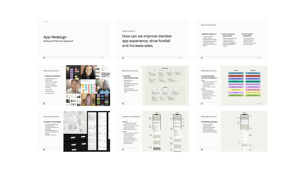
I started gathering feedback early, conducting one-on-one sessions with members from around the globe. Quickly I was able to uncover hidden pain points and insights.
I asked each participant to prioritise features, both existing and requested, using card-sorting exercises.
Then I used the results to quantify how members valued each feature and grouped core insights into actionable themes to form the base of the redesign.
"The app's very generic, show me events I'm interested in, you know my interests & history."
"The app's unexciting, I prefer to just go and see what's on, but I often miss out on good events."
"It's too difficult to cancel events or change bookings; I just email in, they are very friendly."
— SOho House Member Quotes
Balancing Business Objectives
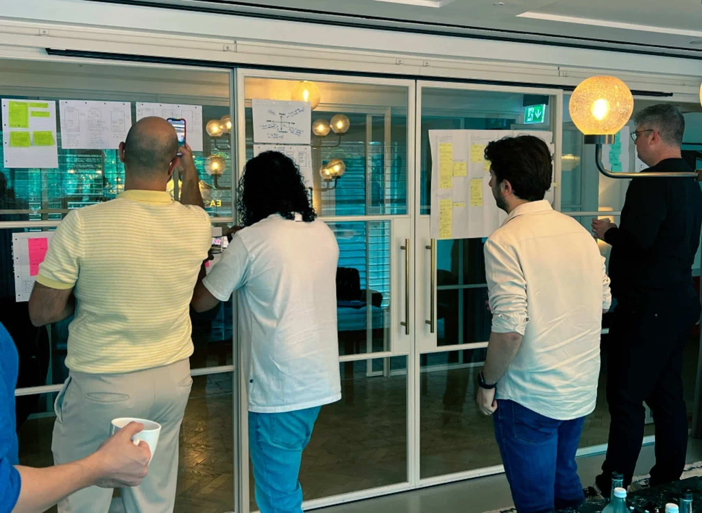
I ran a few workshops with key stakeholders to socialise the feedback I had gathered and integrate ideas and insights from the core teams involved. This collaborative process helped us align design with strategic objectives and gain sign-off.
Strategic objectives
Improve Member Experience
Measured by member satisfaction
Increase Bookings
Driving up hotels, restaurant and events
Drive Footfall
By increasing member & guest occupancy
Collaborating with tech
I worked closely with Soho House's front-end and back-end teams to support design handovers, align development priorities, and oversee accurate implementation.
Created API documentation to outline design features that require new development endpoints.
Led weekly ‘3 Amigos’ sessions with engineers and PMs to plan and scope upcoming designs.
Presented designs in biweekly planning sessions, ensuring alignment with front-end development timelines.
Adapted designs based on technical constraints to meet deadlines while maintaining the integrity of the design.
Visual Design
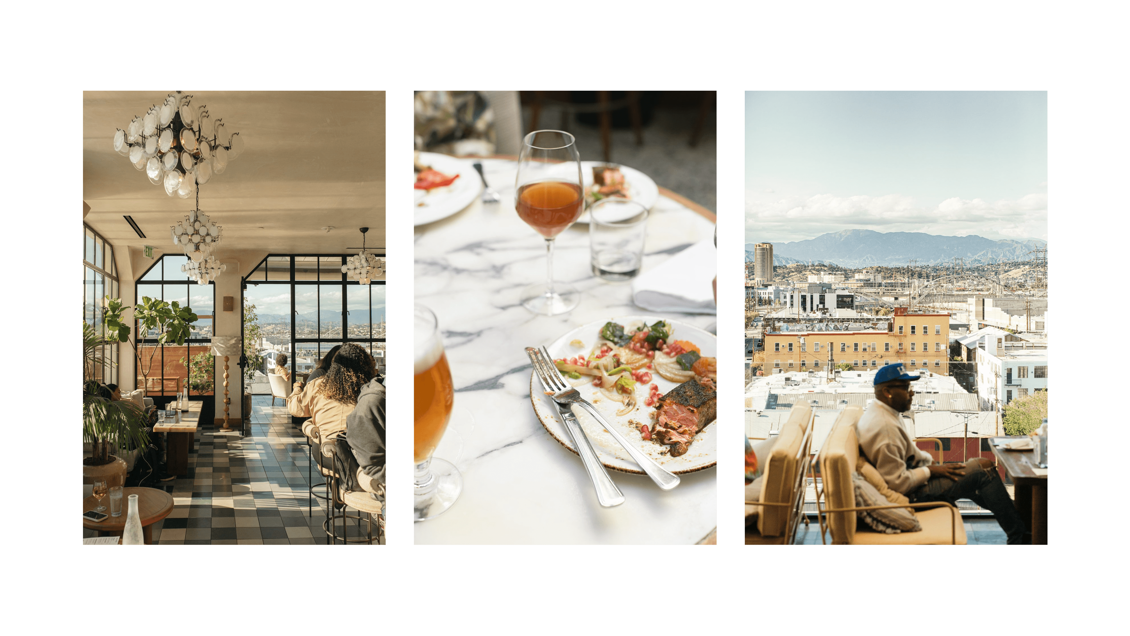
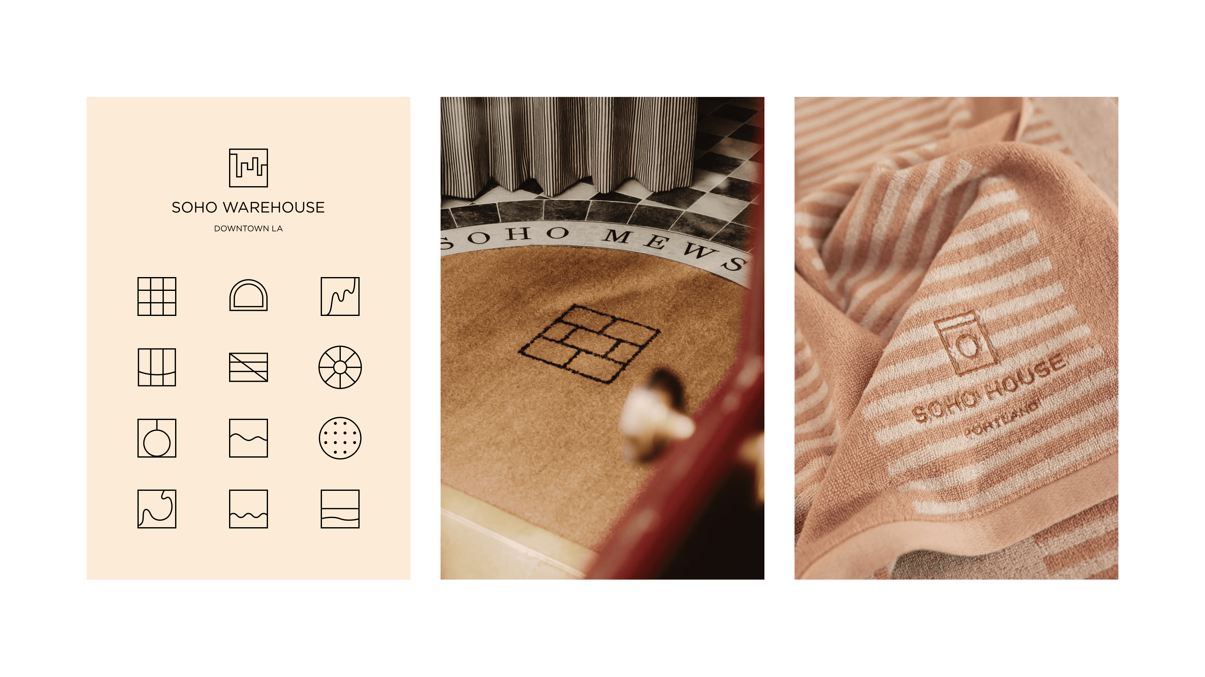
I aimed to incorporate Soho House's physical design elements, combined with quality images of the club, throughout the digital experience. This would help convey the unique vibe and presence of individual spaces and provide a sense of connection to members.
© Soho House
Personal & Revlevent
I designed the app to feel personal, relevant, and fresh whenever opened. Using a modular design with components that dynamically tailor content to each member using their interests, booking history, and location.
Example componeNTs
The redesigned 'What’s On' and 'Where to Eat' modules heavily relied on geolocation to surface events and restaurant availability nearby.
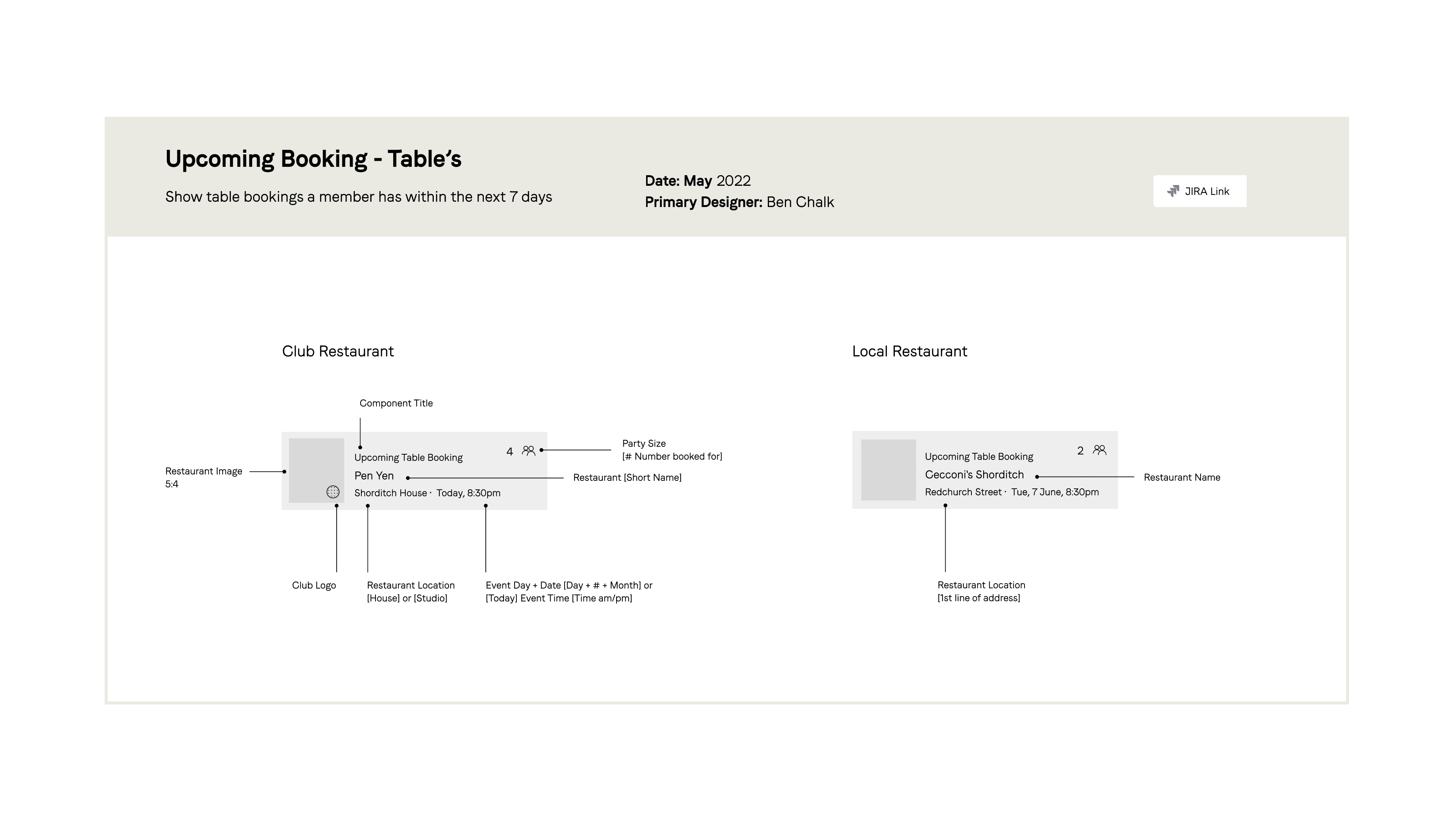
I designed a new 'Upcoming Bookings' module that displays all bookings chronologically in one place. This had a big impact and required four different tech stacks to work seamlessly.
Featured Content
The old app lacked a visual hierarchy, which resulted in members often missing out on good opportunities.
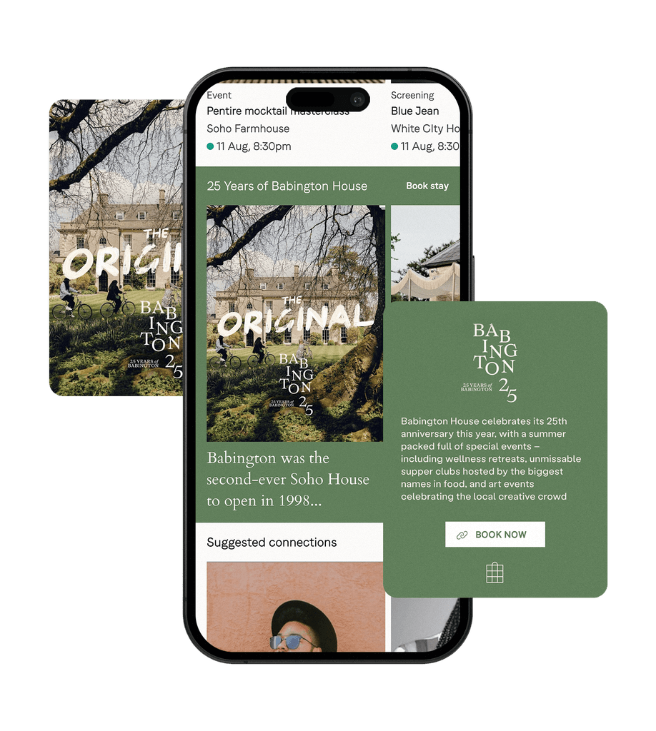
I designed the 'Spotlight' Module, inspired by threaded social stories, to bring a deeper level of discovery and narrative to the app and provide a new way to promote key events.
Used for key events like the Soho House Festival, new Soho Home collection and promotional travel destinations.
Helped drive app engagement for hotel bookings and featured events
Created a more visual and interactive way to showcase content.
Checked-In Experience
I proposed and designed a new 'Checked-In Experience' to better connect and reflect the physical aspect with the digital experience
The design transforms the app when a member taps in.
Club-specific events, live restaurant availability, and quick access to club information and amenities are offered.
'House pay' tab management allows members to quickly settle tabs using an in-app payment, reducing wait times and walkouts.
Suggested connections with members in the same club.
Club Profiles
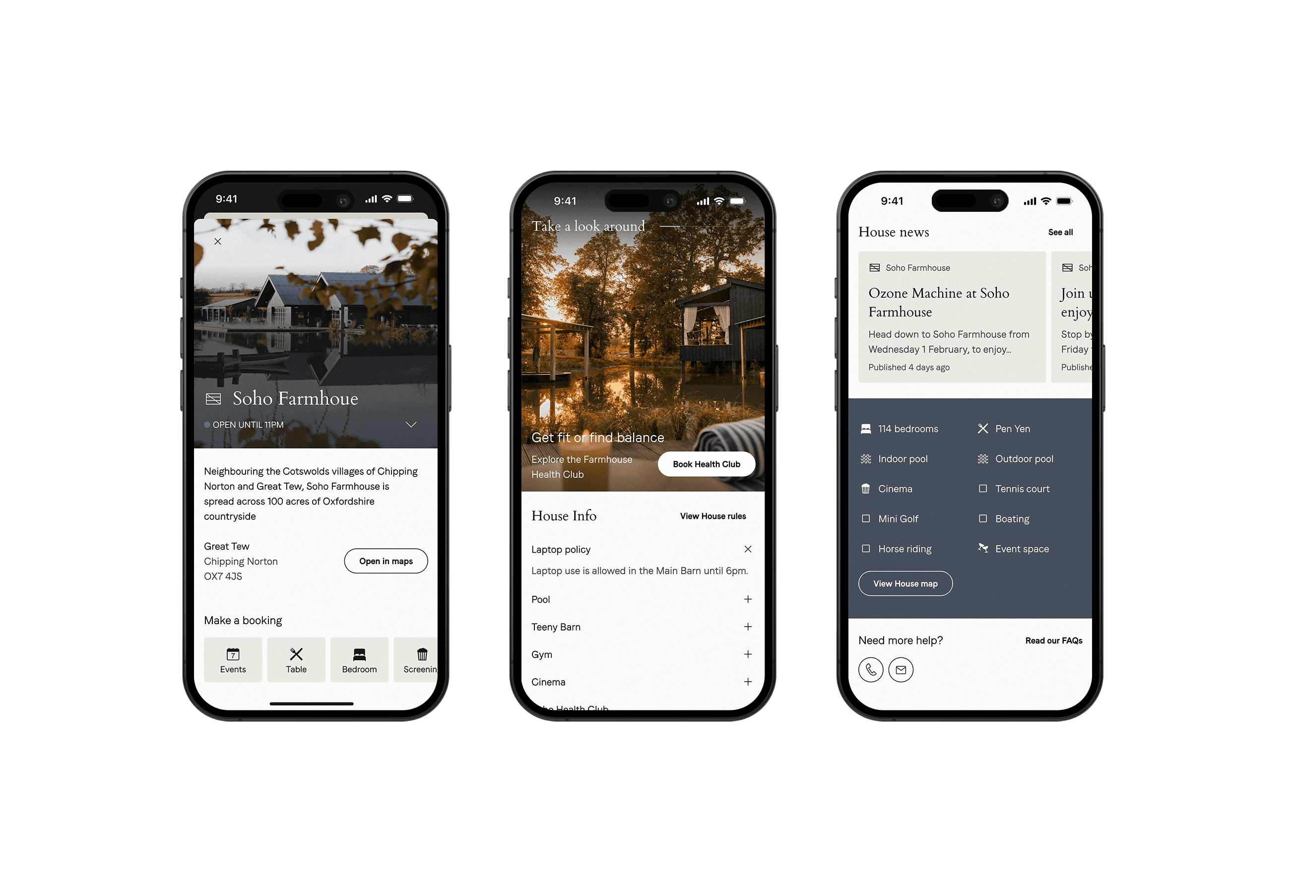
A frustration uncovered from the research was that members struggled to find details about each club. Soho House clubs vary dramatically in space, amenities and events.
Although not a top priority, I was able to reuse some design elements and endpoints created for the 'Checked-in experience' to quickly bring 'Club Profiles' to the app.
Created a 'Club Profile' template used for each of the 44 clubs.
Provided in app access to club photos, amenities, and location-specific updates.
Reduced support inquiries by integrating this information directly into the app.
Included live, opening times, directions and direct contact options.


